Understanding web accessibility standards can be a pretty tricky endeavor for many people. Even people directly in the standards community end up debating for days on end about how a particular specification should be implemented. The misinterpretation of a spec often occurs from an over analyzation of it. Other times it’s because standards have been purposely written as vague as possible to reach the widest audience. These are just some of the annoying ways that makes things especially difficult to interpret things correctly.
I
believe that one of the things that generally keeps people from fully grasping the concepts behind accessibility standards is their actual approach to converting the ideas into practice. For example, when Designers ask me why their headings should be in order, their search relies on the pedantic approach that something regarding the markup of headings should include an answer including everything to do with them. However, the concept of why headings should be in order is more about how information should be presented in a logical way, rather than some mythical trait inherent in the element itself.
It appears that those who rely on how specific markup is implemented tend to fail at understanding the underlying concepts of why something is required to be done in the first place. This failure affects how implementers incorporate accessibility, because they’re getting hung up on the strict definitions they’re used to.
A Tale of Two Approaches
In my opinion, understanding accessibility requires both a conceptual approach as well as a contextual approach. Both approaches are important because they balance the way users will interpret and understand documents.
The Contextual approach
When I refer to a contextual approach, I mean identifying and understanding the purpose of the elements in a document that form the ideas and terms of what can be fully derived from its markup. The strength of how meaningful a web site is depends on the relationship of its tags that make up its structure. For example, most of the basic HTML tutorials I’ve come across will start off showing that what you write in a text editor will show up in the browser. Yet adding the <p> tag to that same text would give it more meaning to anybody (user or machine) looking at it.
A website built with a bunch of paragraph tags might be more meaningful than one without, but it’s meaning would be better defined with other tags that can round out its structure. This is why adding headings, emphasis, etc. becomes so much more important to convey the information on a page.
The Conceptual approach
Contextual information can be really confusing when many tags seem to be used for the same thing. To a Designer, these tags might be more about adding cool hooks to be able to change the style later. Being able to make something look more awesome can make a really tempting argument to use as many tags on a page, regardless of what the meaning behind the individual tags are.
As the contextual approach might be described as identifying and implementing markup in a website that immediately precede or follow an element or group of elements to clarify it’s meaning, the conceptual approach would be defined as the plan or intention behind using an element to explain it’s meaning heuristically.
In other words, understanding why something is used can be just as (if not more so) important as understanding how something is used.
Take quote and blockquote for example. Even the HTML5 specification isn’t very clear about what the difference between the two tags are:
Blockquote
The
blockquoteelement represents content that is quoted from another source
Quote
The
qelement represents some phrasing content quoted from another source
At face value, it seems as though these two tags do relatively the same thing. In terms of where to put them on the page, this same value of choosing one over the other rests solely in the fact that one’s a block level element and the other is inline. Yet the thing about blockquote specifically is that it’s a sectioning root. This means that these elements contain their own document outlines, which don’t get included in the outline of it’s parent elements.
Sectioning Elements as an example
If you google HTML5 outline
, you’ll find a number of warnings about using these kinds of tags. They’ll tell you that there’s no known implementation from a user agent (i.e. a web browser) or assistive technology that even uses it.
The way that meaningful structure has been conveyed (at least as of HTML 4) so far has been through the use of standard heading and div elements. Acknowledging simple rules such as using headings in order can be a relatively simple concept to grasp and web browsers have been able to parse that information quite easily in order to convey structure in a page. Even used incorrectly, this methodology has been so simple that relevant meaning can still be achieved.
HTML5 includes significant organizational improvements, which include new tags such as <nav>, <aside>, <section>, <article>, <header>, and <footer>. Apart from avoiding divitis, Heydon Pickering has a great article on Sectioning elements over at Smashing Magazine which explains the value in using them to provide better structure on a page.
Using Print to Understand Web
To express a gross generalization, I’ve found that most Designers incorporate more of the contextual approach when it comes to applying certain rules or best practices when making a web site. Typical scenarios include situations where designers have told me how they cringe at the idea of accessibility, because it inevitably means that they’ll have less control over the way a site looks. This belief is a hard one to change, because there is some truth in it: If you believe that the desired tool chest at your disposal is a way to make something awesome, a tool chest that has inherent flaws due to a requirement means one less tool at your disposal.
Almost any Designer would agree, however, that choosing the right tool for the job isn’t a case of designing within some obscure limitation, but rather using something that can be as functional as it is creatively formed. For example, fine artists will not paint oil on cardboard unless cardboard is strategically relevant to the artistic process. Cardboard isn’t archival, which means it won’t stand up over time. Worse, oil has a tendency to destroy cardboard in most cases. Applying this metaphor to web design, the right archival media to paint on is a contextual problem. Determining how this will affect the artistic process becomes a conceptual problem.
In my opinion, understanding the why behind the use of specific tags are used is just as — if not more important than — how specific tags are used. While this area generally teeters on the theory behind using specific tags, important analogies can be drawn from the place these tags receive their name sake.
A Real World Example
If you read my last post, you’d know that I’m taking a bunch of classes on some web languages that I’m not exactly familiar with. As I stated in that article, a lot of web training ends up being redundant rule mongering, and the current course I’m on is more or less a bit of a primer refresher course. Perhaps due to my CDO or given the fact that I want to complete my $59 worth, I’m taking a rudimentary course on Building HTML & CSS from Scratch from Udemy.
At the end of each section of the course, there’s a little quiz to go over what you’ve learned. For the most part the quizzes are fairly good, but I was a little annoyed when I came across both the section for Sectioning Tags and it’s quiz. In the quiz, I was asked how to correctly write out each sectioning tag.
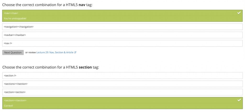
Like using the word to describe its definition, asking me how to markup a nav tag is just as useless for understanding when they’re needed.
According to the guy teaching the course, the only reason why you’d want to use tags like <heading>, <aside>, <article>, <nav>, etc. is to make things more “semantic.” The term “semantic” is starting to get thrown around in Designer and Developer circles, like it’s the deciding word that separates noob from the pros. That’s great and all, but frankly speaking, what the hell does semantic even mean? In its most basic definition, semantics is essentially adhering to standards through which a site can infer meaning. This goes back to the problem of solely referring to how specific markup improves the relationship of information. Metaphorically speaking, making your Designs more semantic means better design. Reading the specifications for these tags leaves one to wonder how they ultimately differ from each other and when exactly one should be using them.
The Print Model
In a previous life, I worked as a Production Artist for a company that printed out a bunch of community newspapers. My job was predominantly layout, and as memory serves, it was a rather tedious job. Case in point, the highlight of my job was being able to design the cover pages of specific sections of the newspaper. Man, it was boring.
Regardless, the easiest way to explain the relevance of semantic information on a web site is to look at how it’s been handled in the past. Take the following example, a section of the community newspaper I designed way back in ’06.
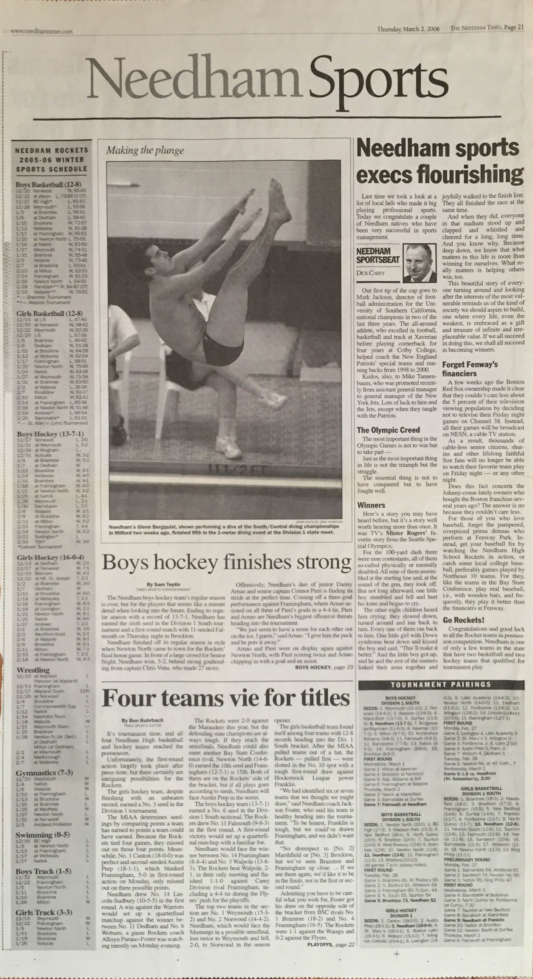
Needham Sports page
I was stuck designing within a style guide for the Needham Times when I laid out the Needham Sports page. Determining where each article would go in this section was about the only freedom I was able to have, and even then it required specific formatting requirements from the Creative Director’s pre-built library.
Using the Contextual Approach
From an organizational perspective, the newspaper presents a good example of how logical layout is enhanced with the usage of Sectioning Elements. The Needham Sports is the equivalent of a Section, because it’s a grouping of one or more structural groups that are thematically similar, yet are functionally separate.
If this were laid out without HTML5 Sectioning Elements (i.e. the way it’s usually done), it would be organized like so:
<h1>Needham Sports</h2>

<h2>Making the plunge</h2>

<h2>Boys hockey team finishes strong</h2>

<h2>Needham sports execs flourishing</h2>

<h3>The Olympic Creed</h3>

<h3>Winners</h3>

<h3>Forget Fenway's Financiers</h3>

<h3>Go Rockets!</h3>

<h2>Four teams vie for title</h2>

<h3>Tournament Pairings</h3>

<h4>Boys Hockey Division 1 South</h4>

<h4>Boys Basketball Division 1 South</h4>

...

<h5>Preliminary Round</h5>

<h5>First Round</h5>

<h2>Needham Rockets 2005-06 Winter Sports Schedule</h2>

<h3>Boys Basketball</h3>

<h3>Girls Basketball</h3>

...
From a contextual standpoint, this would be a fairly accurate depiction of what’s going on in the page. The <H2>s on the page are clearly separating out the articles so everything is being presented correctly. Yet it’s not really an accurate depiction of what’s going on in the document, especially if this section is part of a much larger newspaper.
Using the Conceptual Approach
More than likely, readers would have seen a huge 2 column photo of a diver making a leap in the middle of the page. Obviously this was done on purpose, but a little closer observation is required to know that the Hockey article has nothing to do with it. The editorial on the right has a bunch of little stories in it, and below the fold are two stories about Needham Tournaments. If I were to describe this page to my friend across the breakfast table, I would be suggest the following:
- A Sports Schedule
- A photo story
- Boys Hockey Stuff
- An editorial piece
- Tournament stuff
I’ve just broken down the page into five separate things by looking at the most important portions of the current page. Conceptually, this is simply the most relevant information about the page, and it just categorized the content into relevant subject matter. Now, this could be achieved using the same method as above with headings by using a slew of <div>s, but that information is only going to be relevant to someone looking at the page. How the browser presents that same content back to the end user is lost because <div>s are structurally irrelevant to the way content in a document flows from one concept to another in terms of its structure.
The problem with ignoring the Outline is that it relies upon headings to break down the investigation of its content. Conceptually, content isn’t really described this way. When referring to different aspects of the document, people will have an easier time when there is a strong relationships shared between content. When designing a page, providing a better structure will help to eliminate confusion and help to get people to the stuff that matters most. It provides a richer user experience, which helps to make you appear as an experienced designer.
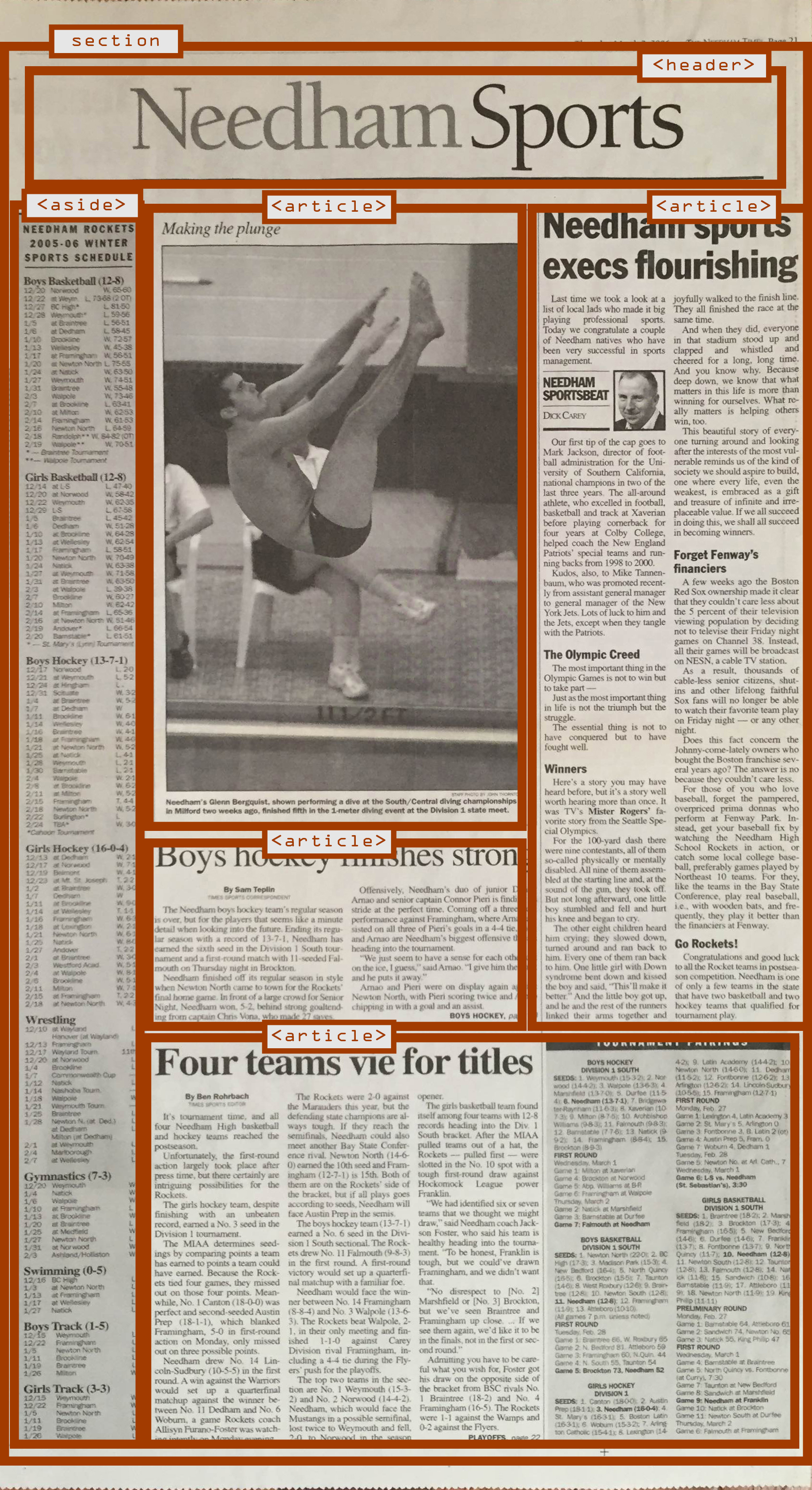 Marking this whole page up with Sectioning Elements, I have same level of control over the categories as I would using <div>s but now I’ve got a super awesome advantage. Since these things relate to the document outline, how I present the content is theoretically* logical to everyone. Now when I refer to something to my friend eating breakfast with me, “It’s that article in the editorial about how Red Sox Execs don’t care about some TV viewers” means the same to him whether I’m telling it to him or whether he’s actually reading it. To run with this metaphor, this distinction is the equivalent of what happens when someone with a screen reader is accessing the content.
Very cool things start to take place when we do this. Not only are we able to design categories for what’s going on, but we also get to form the relationships between everything else going on. Before HTML5, we relied on headings to convey the relationship within the page, but since I’m using Sectioning Elements, I don’t need to rely on headings the same way.
Now the Outline should look like this:
<section>

<header>

<aside>

[The sports schedule]

<article>

[A photo story]

<article>

[Boys Hockey Stuff]

<article>

[An editorial piece]

<article>

[Tournament stuff]
Combining the two approaches together
Now, imagine my friend is about to stuff his mouth full of Cheerios before asking me, “What’s up with that editorial?” (My hypothetical friend apparently cares about other people’s opinions). I would respond by saying that it’s basically an article for the Needham Sportsbeat that talks about winners and losers in the community.” In this regard, I’ve broken down the important information and how it relates to the entire article. Conceptually, it makes sense to mark up this article the same way.
 Since I’m not relying on headings to convey the relationship on the document, I can harness their value by conveying the relationship to the current section and how that relates to the rest of the document. In doing so, I’m also strengthening the relationship between other aspects of the document. This is because, in the overall context of this newspaper as a whole, the structure that brought us here would be like this:
Cover Page → Cover Content → Various Sections → Sports Section → Editorial Article
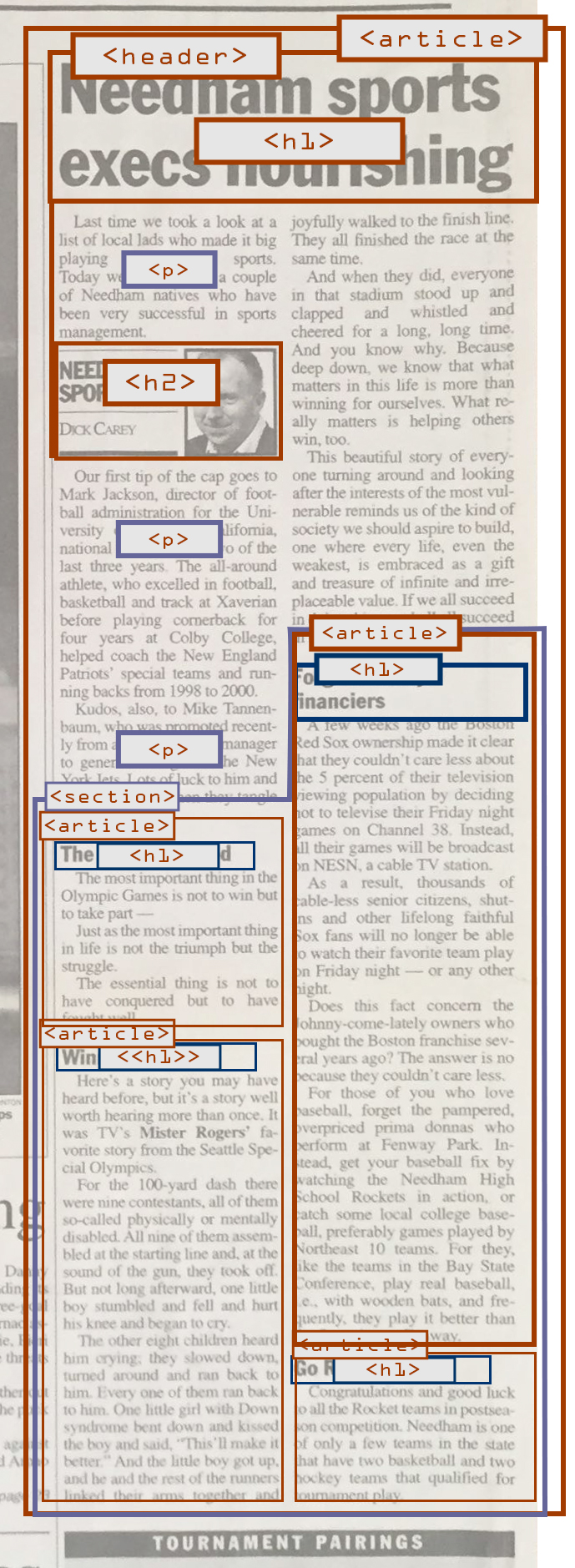
Each element within this article will also continue strengthening the overall relationship, because the Outline continues to provide semantic information. In this case, the layout presents a heading over two columns, a paragraph, the author’s byline and column title, before some other paragraphs. From here there’s four stories that are separate from the editorial article but is still owned by it. Let me break down the markup using a conceptual approach to explain when these elements would be used:
The whole editorial is wrapped in an <article> because it represents a standalone story that is related to the entire section of the Sports page. From here, a <header> element contains the main heading of the article, as well as the title of the article. Since the editorial is a standalone story, I’d marked the Opening header as an <H1>. I know that the rules for HTML5 prohibit the use of headings for subtitles, but I believe the editorial column title is conceptually separate from the main article heading, so I would markup the column title as an <h2>.
Each of the stories that follow would be wrapped within <section>. This element is often confused with the <article> element, but contextually I understand that sections are related items that are separated from the whole. Conceptually, I would consider sections of an orange: Each individual slice is still a part of the entire orange, yet each have their own separate values. Likewise, each following individual story is too independent to be considered it’s own section, yet it’s content is conceptually related through the theme of the author’s article.
Thus, as each of these stories within the <section> element is considered to have content that is independent from one another, they also deserve to be their own <article>. Technically, an <aside> wouldn’t work here, because I know that the purpose of that element is to be used when content veers off topic, or something that could provide a further explanation about the overall content that isn’t directly consequential to the content (like a glossary). Theoretically approaching this problem means interpreting these side stories as not veering off topic. Since they stand on their own in terms of what they are, each story receives an <H1>.
Why? Because conceptually I’m making the argument that each story’s heading is the most important aspect of the content. In terms of what this means for the rest of the column as a whole is that each story has one “most” important element that explains it’s role in a broader context. This involves the relationship these articles have with it’s parent article, which is defined through the relationship of it’s position in the greater section of the Sports page. Essentially, working the problem of the structure backwards helps me to understand how everything fits together both contextually and conceptually.
*Damned Caveats
It goes without saying that not everything can be perfect. Even though technically the HTML5 Outline is in the Specifications, there’s no guarantee that user agents or assistive technology will get around to implementing them. Does this mean Designers should avoid using it? Hell no! It provides a means to make your design stronger, it’s built with the highest standard, and has the potential to provide better meaning to the end user.
Design is more than just making things pretty. It involves helping people obtain information quickly and efficiently, achieved through complex problem solving, and investigating how the information presented and organized will affect others. If the standard tells you something should be part of your tool chest that will make it easier for Designers to do this, Designers should fight for their right to use it.
When other articles about Outline tell you to be careful when using it, obviously make sure that it’d work if a Browser developer is being an idiot and doesn’t use Outline. But then submit a bug report or take to Twitter to demand they adhere to the standard.
A final note
Standards and specifications can be insanely difficult to understand, but they can be infinitely more confusing when one strips away a relatively decent resource right from the beginning. In this specific example, we looked at how print handled the concepts of the same terminology used for the web. If we didn’t use the print example, we might have gotten caught up in the bizarre wording that Standards are generally written in. Worse, the resources out there basically reiterate the same gobbledygook that the specification offers (Another example of this would be to try to find an explanation of what “flow content” is, where the only definition is not from the specification).
Understanding the rules that make up semantic information on a web site is crucial to delivering designs that can hold up on their own, but mastering the theory behind why and when to use these rules will make your work that much better. People can tell the difference between good art and shitty web design from a general lack of understanding and experience. Anybody can mark up a page according to directions, but it takes a Designer to make quality art.
You must log in to post a comment.